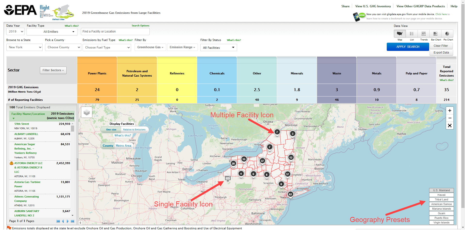
Map
Mouse-over a facility icon on the map to display summary information for that facility and click the icon to show detailed information on that facility. Round black icons on the map represent multiple facilities in close proximity to each other. The number in the center of each black icon represents the count of facilities in that area. Click the buttons in the lower right of the map to quickly find areas outside the continental US, such as Alaska, Hawaii or Puerto Rico. Click image to expand below
 Demographic Views
When the option to select a Demographic Index is available you my click that box to enable demographic data displayed by Census block. Within this selection you may opt to display by County or Metro area. Census block will be shaded to indicate the Percent Low-Income: The percent of a census blocks group's population in households where the household income is less than or equal to twice the federal "poverty level" and Percent People of Color: The percent of individuals in a census block group who list their racial status as a race other than white alone and/or list their ethnicity as Hispanic or Latino. Click image to expand below
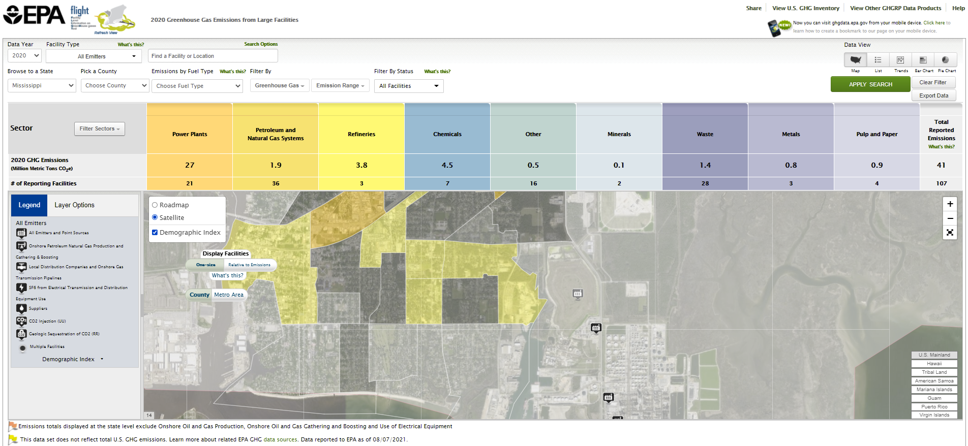 Image Added Image Added
| Column |
|---|
| List
Data lists may be organized by geography (sectors within states/counties), by facility in the current year, or by changes in facility emissions across multiple years. Use the toggle buttons above the visualization window to reorganize the data and click the column headers to sort.
| Center |
|---|
| Facility List Geography |
|
|---|
Click image to expand below 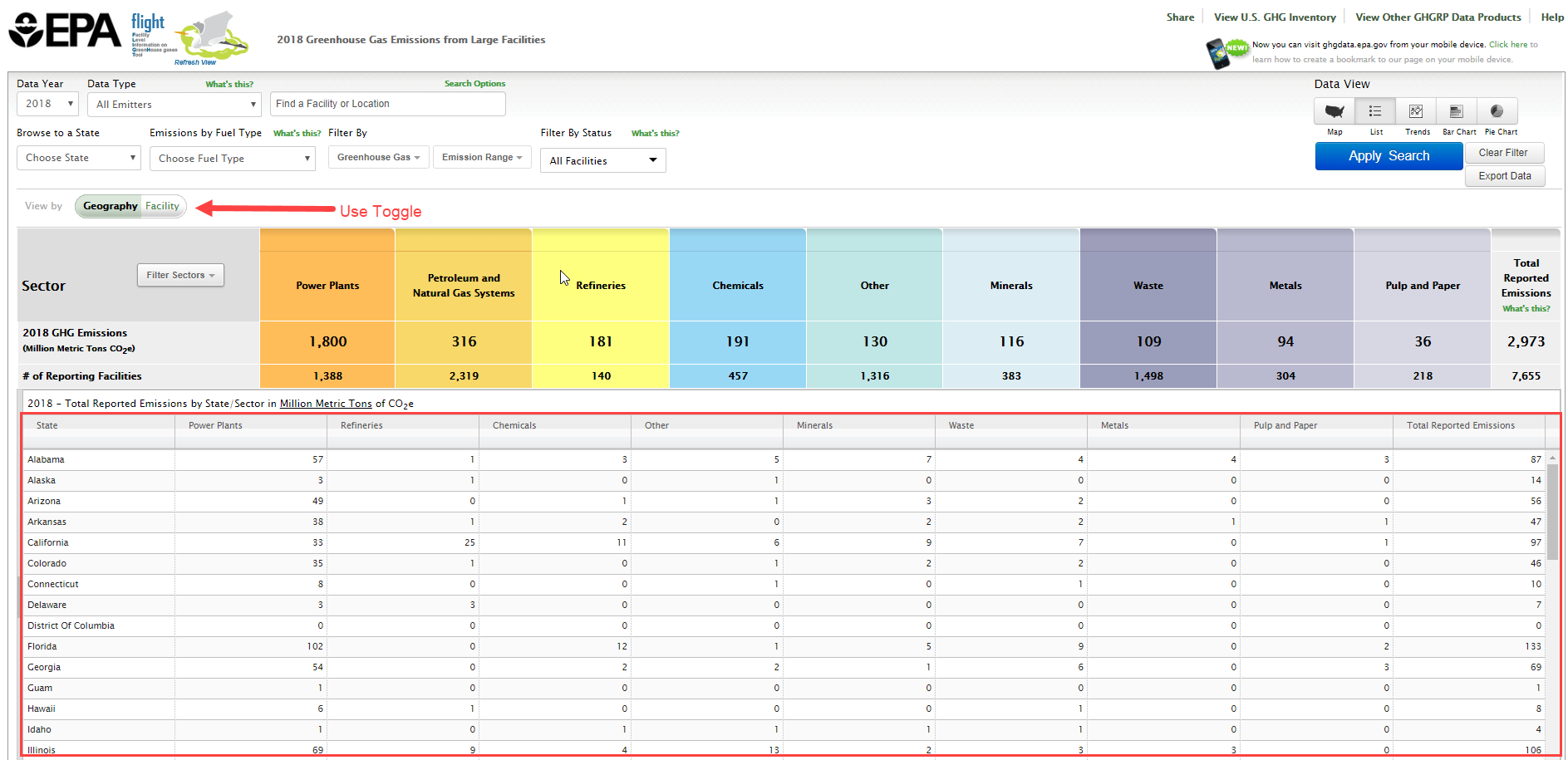 Image Added Image Added |
| Center |
|---|
| Facility List Current Year |
|
|---|
Click image to expand below 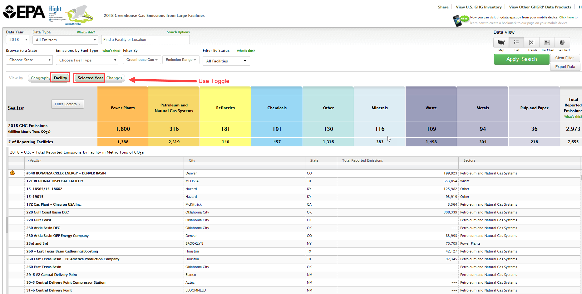 Image Added Image Added |
| Center |
|---|
| Facility List Changes |
|
|---|
Click image to expand below 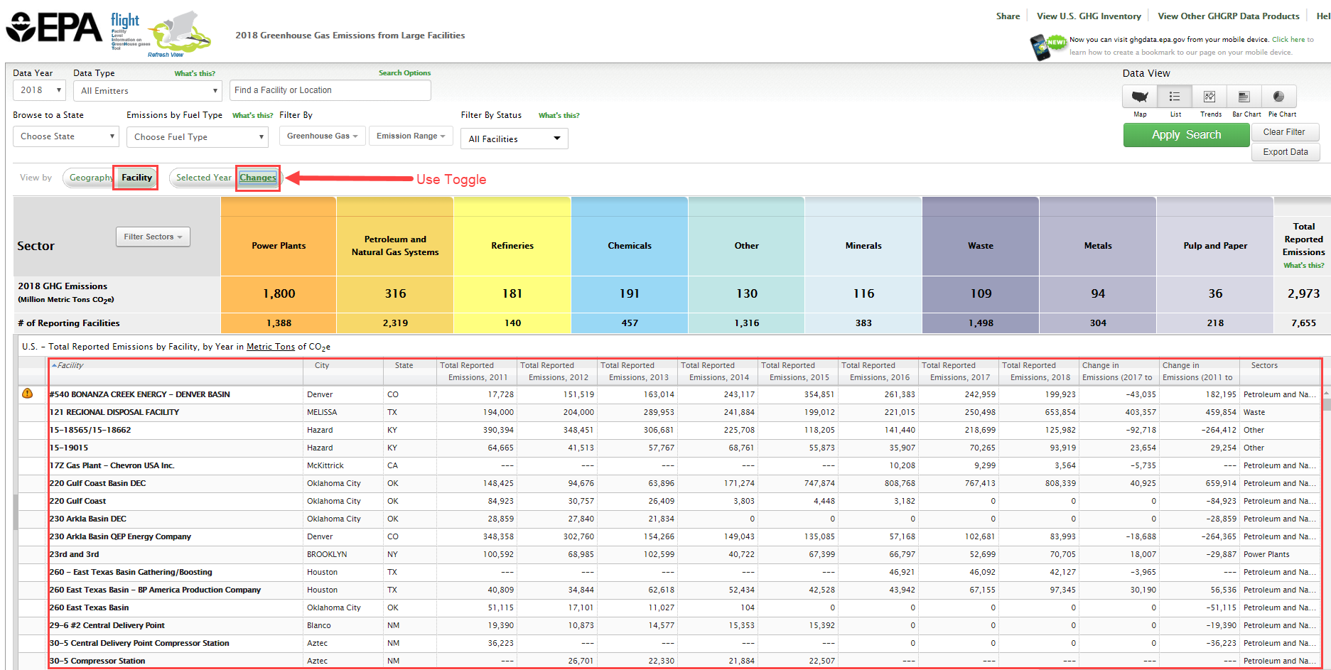 Image Added Image Added |
Charts
Users may view the data in three chart formats: bar chart, pie chart, or line chart. Use the toggle buttons above the visualization window to change chart type. |
|---|
Click image to expand below 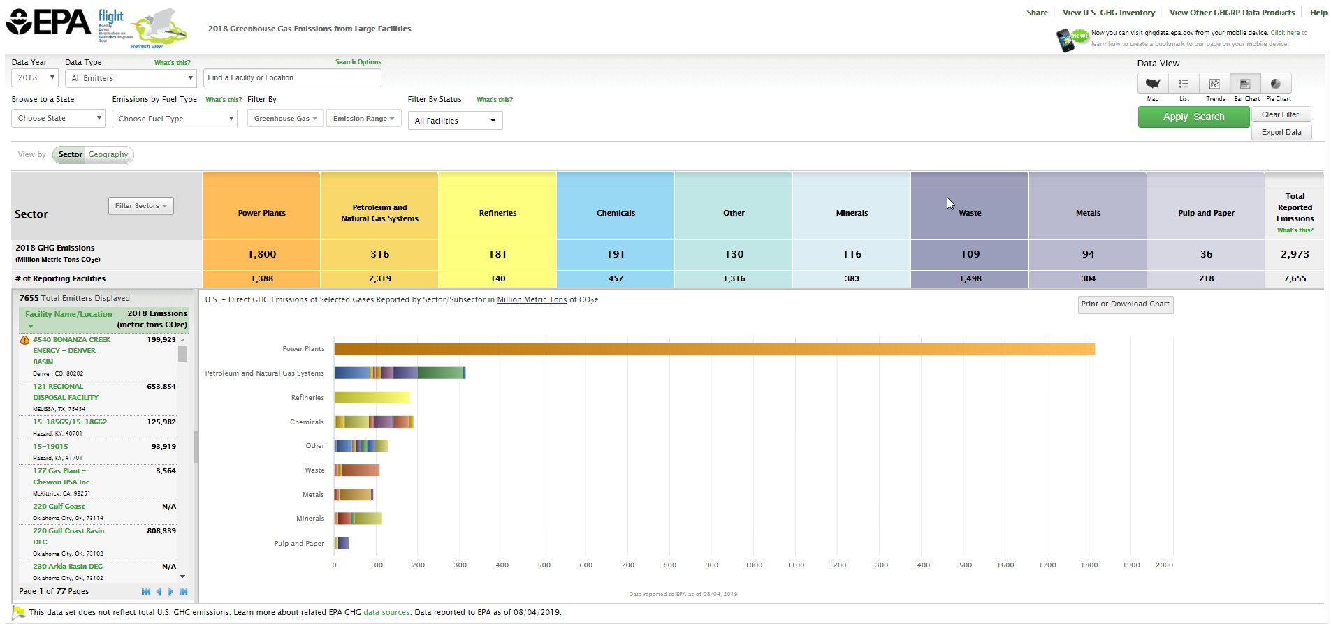 Image Added Image Added |
|
|---|
Click image to expand below 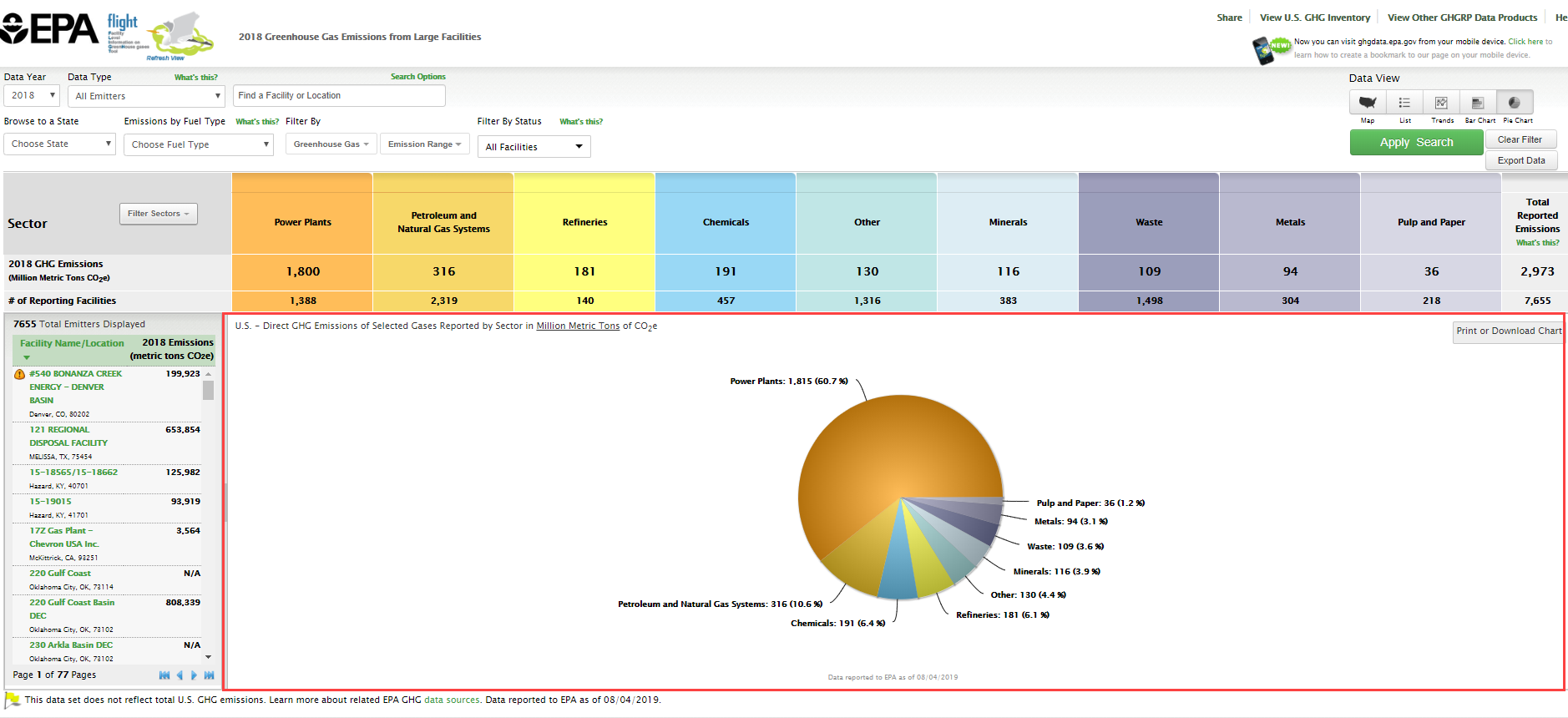 Image Added Image Added |
|
|---|
Click image to expand below 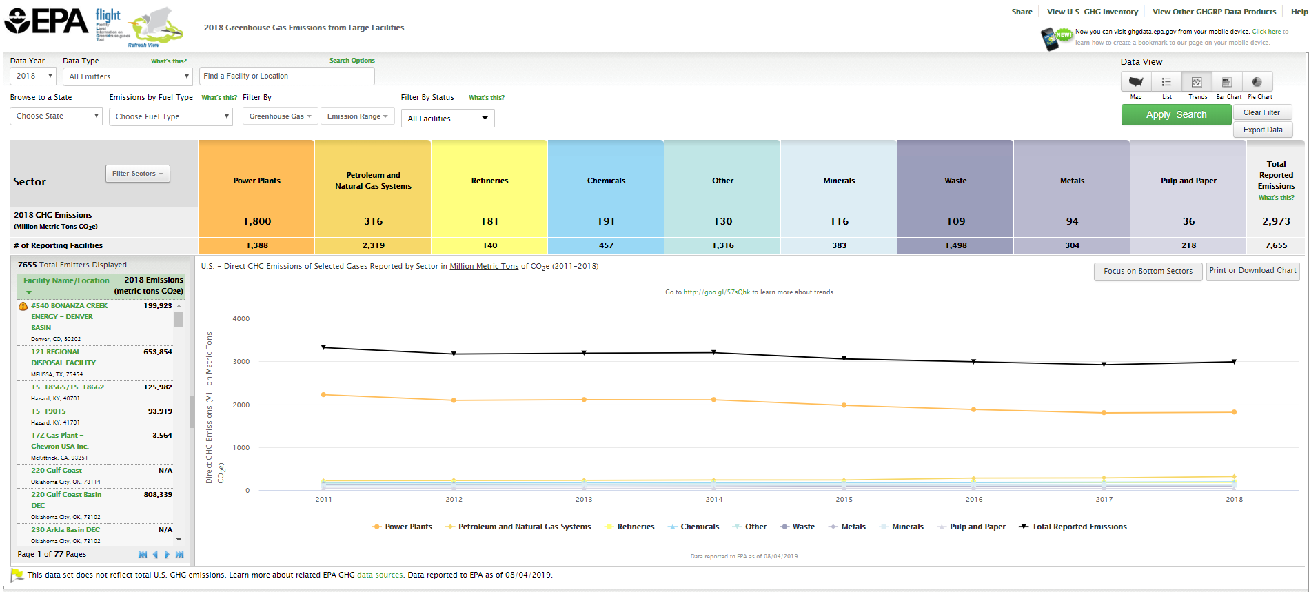 Image Added Image Added |
|
List
Data lists may be organized by geography (sectors within states/counties), by facility in the current year, or by changes in facility emissions across multiple years. Use the toggle buttons above the visualization window to reorganize the data and click the column headers to sort.
| Center |
|---|
| Facility List Geography |
|
|---|
Click image to expand below |
| Center |
|---|
| Facility List Current Year |
|
|---|
Click image to expand below |
| Center |
|---|
| Facility List Changes |
|
|---|
Click image to expand below |
Charts
Users may view the data in three chart formats: bar chart, pie chart, or line chart. Use the toggle buttons above the visualization window to change chart type. |
|---|
Click image to expand below |
|
|---|
Click image to expand below |
|
|---|
Click image to expand below |
|