This page provides an overview of the basic features of FLIGHT.
Getting Started
When you first log into Facility Level Information on GreenHouse gases Tool (FLIGHT), you will be presented with Important Information about this Data Set and two search options:
- View all U.S. Facility Data
- View Facilities in your State
Click image to expand below 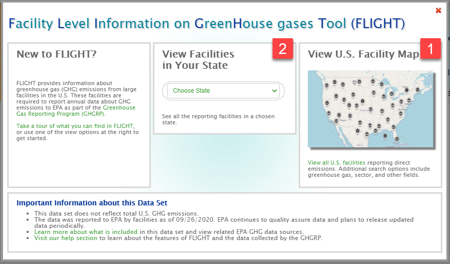
To view all reporting facilities in a particular state, use the drop-down menu in the "View Facilities In Your State" box to select a state.
To view emissions for a particular facility or location, use the search bar in the custom search box.
Search Filters
Use the search filters to the left and right above the map to filter the data by Data Year, Data Type, Facility Name, State, Fuel Type, GHG or Emissions Range. Use the search bar at the top left to perform custom searches for locations or specific facilities.
Click image to expand below 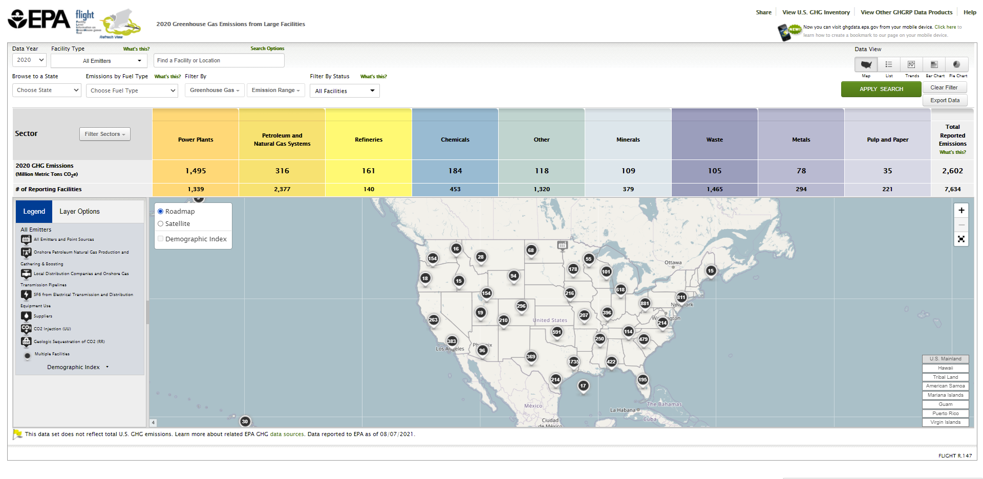
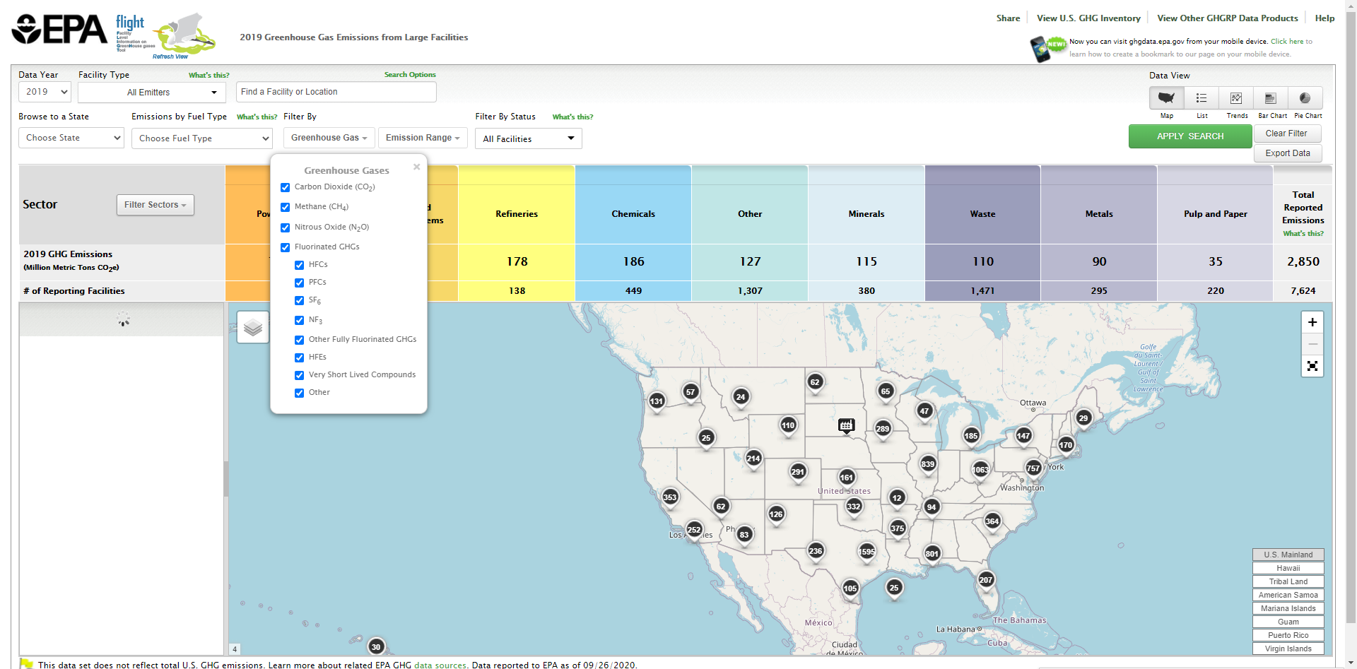
Click the "GREENHOUSE GAS" drop-down bar, and use the checkboxes to filter by GHG type (all GHG types are initially selected by default). Once you have made your selections, click "APPLY" to apply the filter to the map and data. You may minimize the "GREENHOUSE GAS" drop-down bar by clicking it again, or you may get rid of it by clicking the "x" in the top right corner of it.
Click image to expand below 

Click the "EMISSIONS RANGE" drop-down, and drag the sliders to set a minimum and/or maximum value for annual facility emissions. Alternatively, you may type minimum and maximum values manually in the provided text boxes. Once you have set your minimum and maximum values, click "APPLY" to apply the filter to the map and data. You may minimize the "EMISSIONS RANGE" drop-down bar by clicking it again, or you may get rid of it by clicking the "x" in the top right corner of it.
Click image to expand below 
List of Emitters
Once you have made a selection to view a list, bar chart, line chart, or pie chart in the upper right corner, the left-hand sidebar lists the name, location, and total emissions (in metric tons CO2e) for all reporting facilities that meet the data year, spatial, GHG type, and emissions range criteria you have selected using the filters.
Click image to expand below

Initially, the list is sorted alphabetically by facility name. You may click the column headers to re-sort the list reverse-alphabetically by facility name or location.
Depending on the number of facilities listed, your list may extend onto multiple pages. The total number of list pages is displayed below the left-sidebar list. Click the single arrow buttons left or right to move a single page backward or forward. To jump to the beginning or end of the list, click the double arrows left or right.
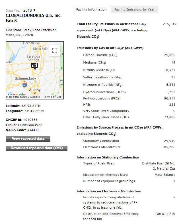
You may click a facility name to view the following information for the facility:
- City & state
- Latitude/Longitude
- NAICS code
- Facility ID
- Emissions Trend over multiple years
- Emissions Information for the selected year
- Total Facility Emissions in metric tons CO2e
- Emissions by Gas
- Emissions by Source/Process
Click image to expand below 
Sector Filter
The multi-colored table at the top of the screen contains emissions and facility count data aggregated by sector for facilities that meet your filter criteria. You may use the checkboxes in the table to filter out specific sectors or source categories. All sectors and source categories are initially selected by default. The Petroleum and Natural Gas Systems, Chemicals, Other, Waste, Metals, Minerals, and Pulp and Paper sectors capture multiple source categories. To view and/or filter by these source categories, click on the "Filter Sectors" drop down menu in the left-most box, and then use the check boxes to tailor results. Note: users may select several check boxes at one time, across several different sectors.
Click image to expand below 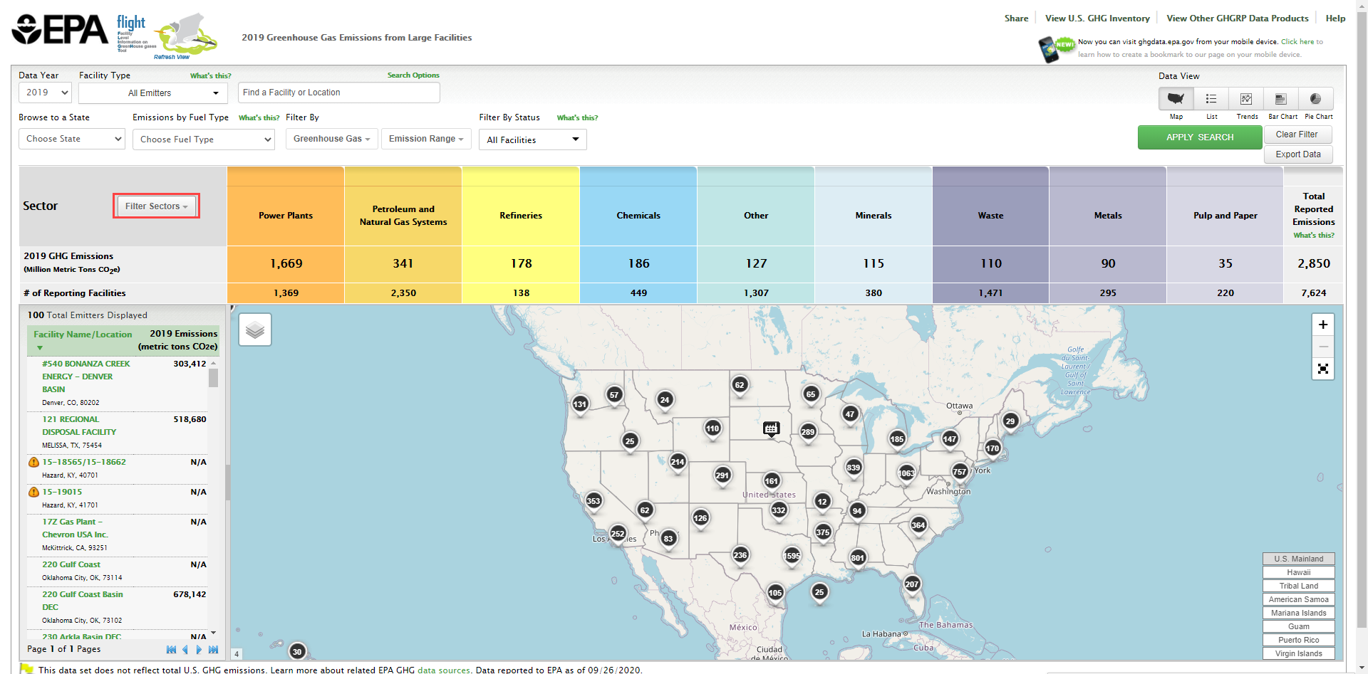

Note: users may select several check boxes at one time, across several different sectors.
click this image to expand below
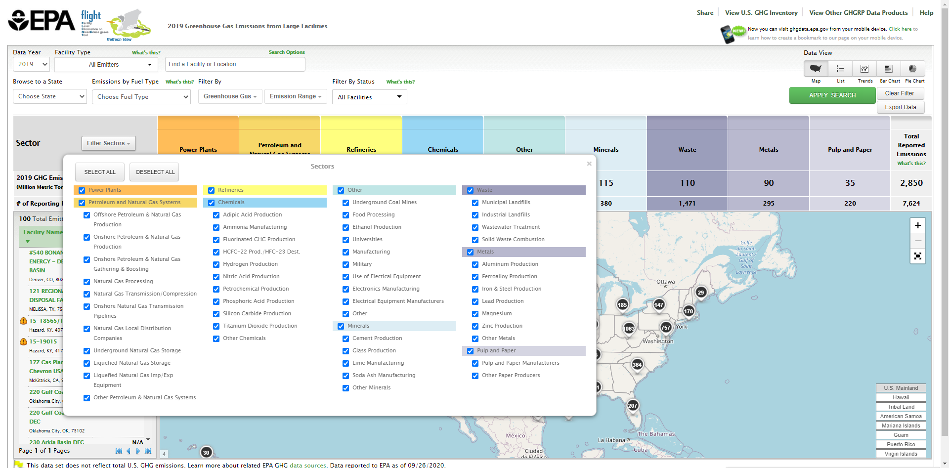

Visualizations
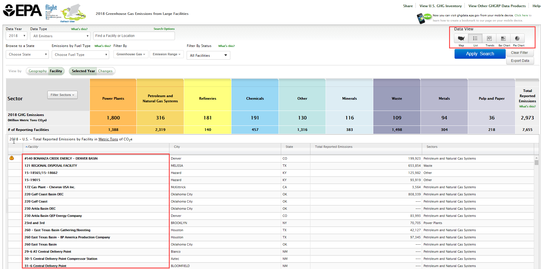
FLIGHT allows you to visualize data in several formats. Use the buttons in the top right of the screen to select your desired visualization format. From left to right, these buttons represent the following visualizations; map, list, line chart, bar chart, or pie chart. Use the drop-down menu in the top left-center to select a geographic filter (e.g, state/county).
Click image to expand below 

Map
Mouse-over a facility icon on the map to display summary information for that facility and click the icon to show detailed information on that facility. Round black icons on the map represent multiple facilities in close proximity to each other. The number in the center of each black icon represents the count of facilities in that area. Click the buttons in the lower right of the map to quickly find areas outside the continental US, such as Alaska, Hawaii or Puerto Rico.
Click image to expand below 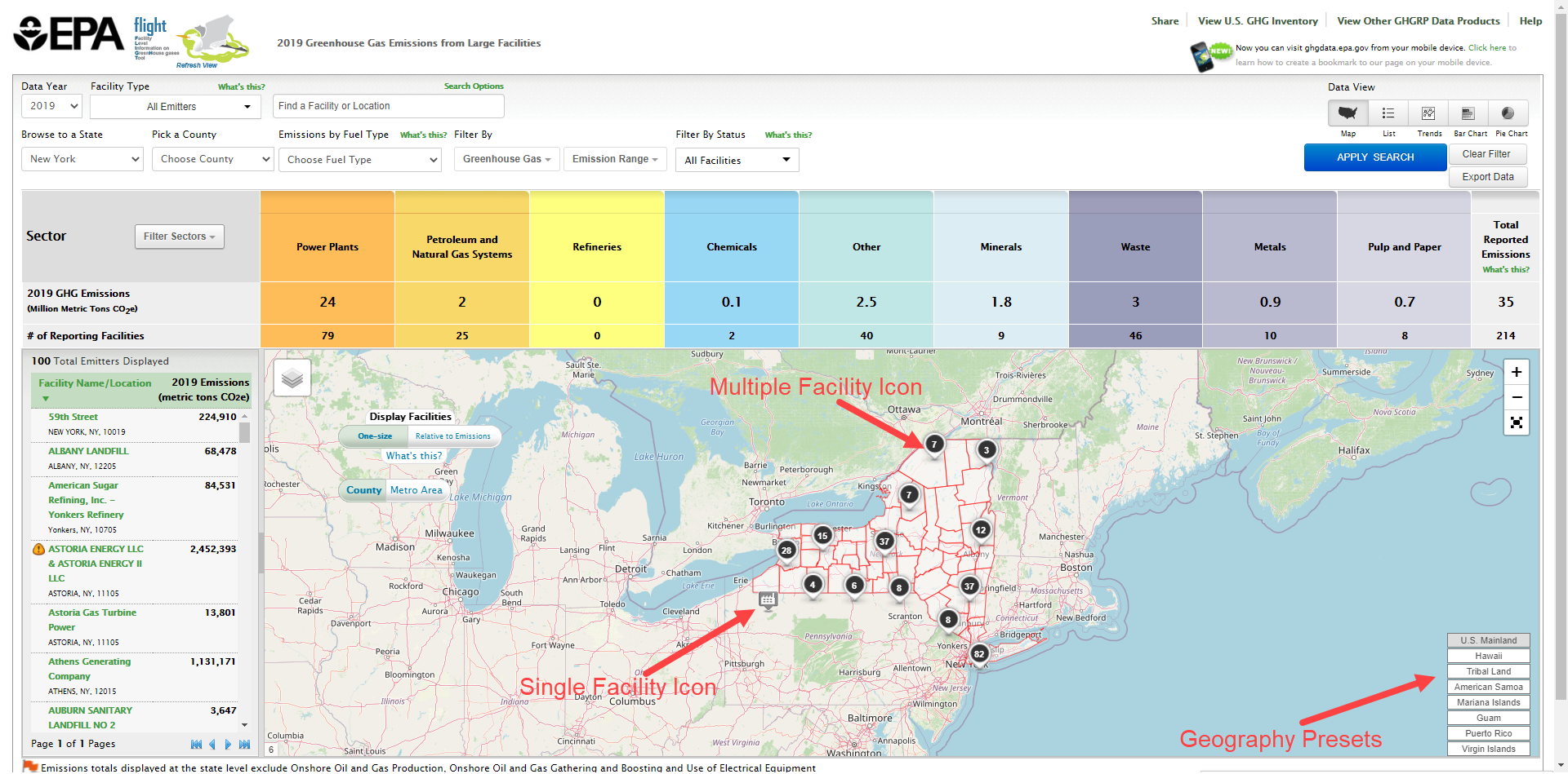
Demographic Views
When the option to select a Demographic Index is available you my click that box to enable demographic data displayed by Census block. Within this selection you may opt to display by County or Metro area. Census block will be shaded to indicate the Percent Low-Income: The percent of a census blocks group's population in households where the household income is less than or equal to twice the federal "poverty level" and Percent People of Color: The percent of individuals in a census block group who list their racial status as a race other than white alone and/or list their ethnicity as Hispanic or Latino.
Click image to expand below 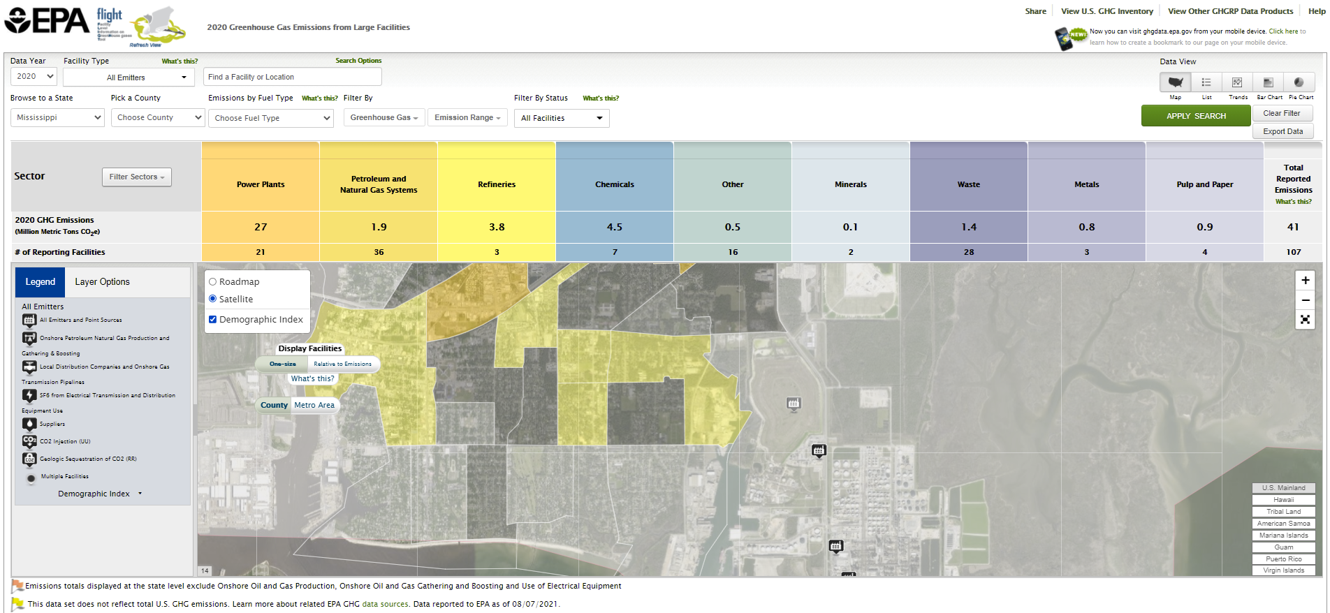
List
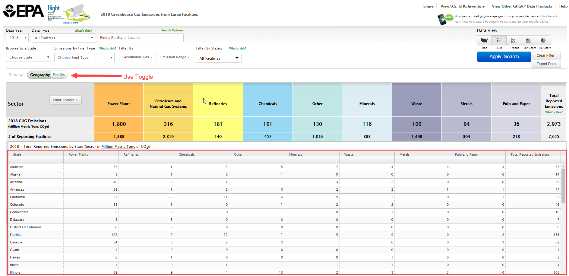
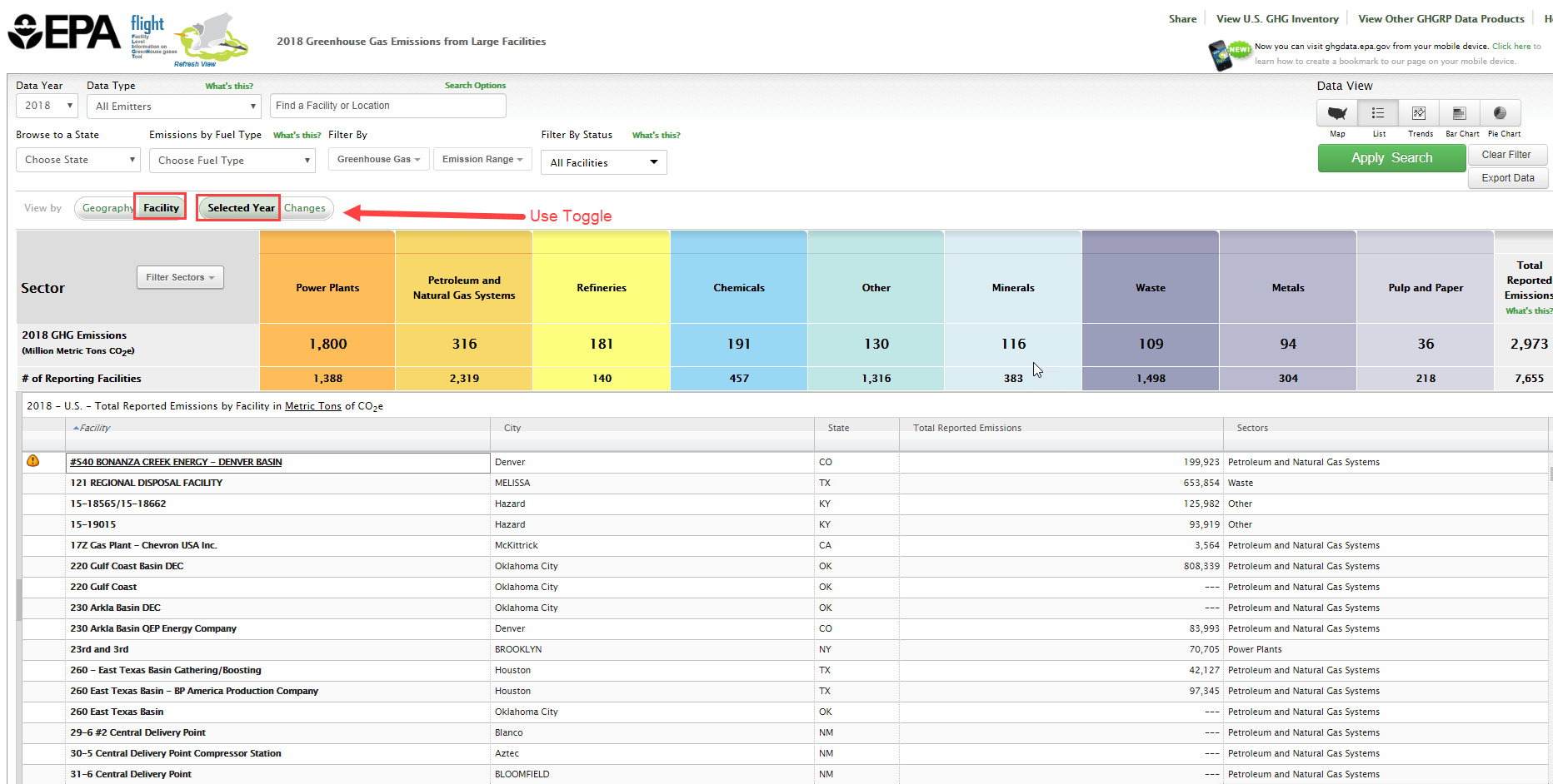
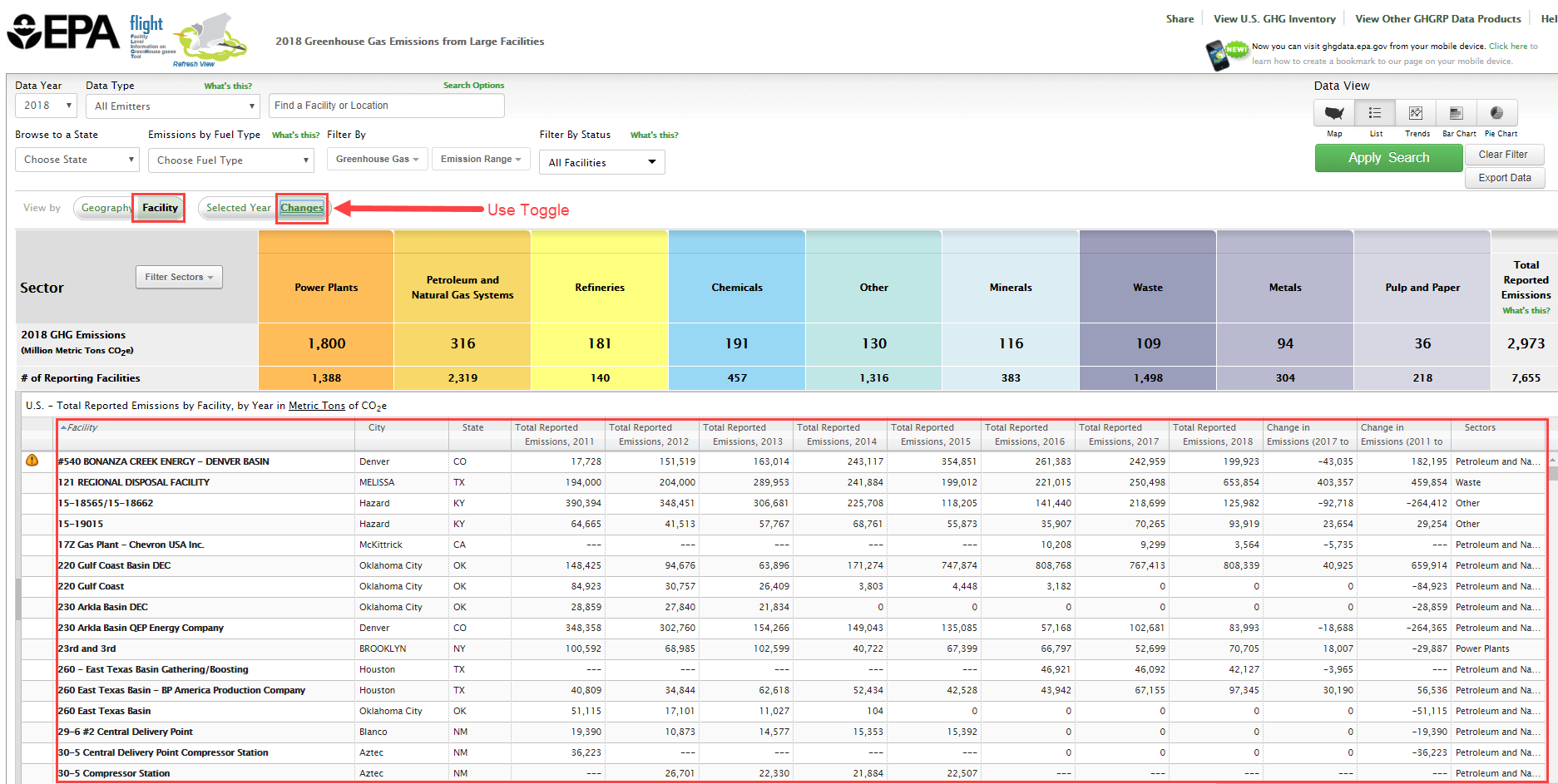
Data lists may be organized by geography (sectors within states/counties), by facility in the current year, or by changes in facility emissions across multiple years. Use the toggle buttons above the visualization window to reorganize the data and click the column headers to sort.
Facility List Geography
|
|---|
Click image to expand below |

Facility List Current Year
|
|---|
Click image to expand below |

Facility List Changes
|
|---|
Click image to expand below |

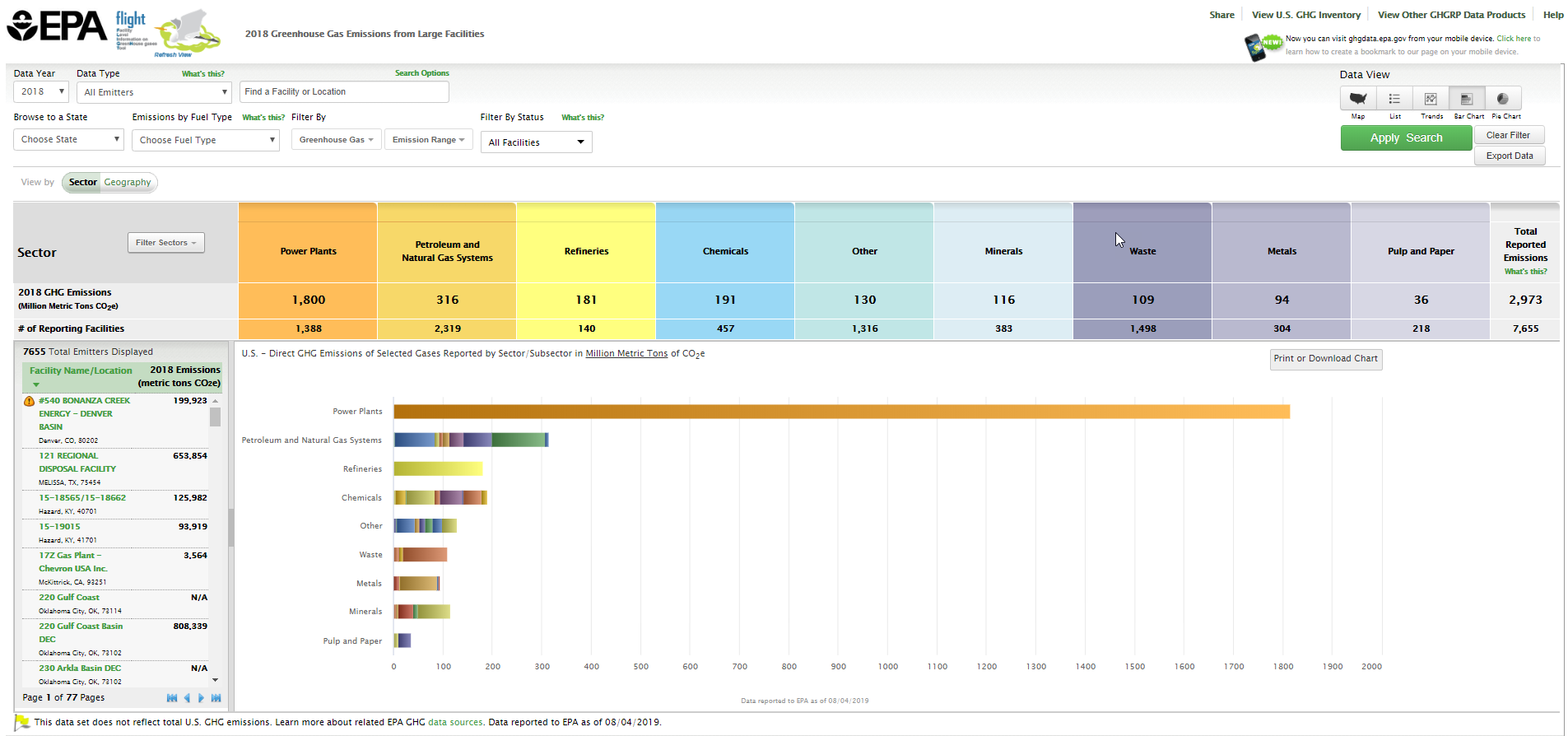
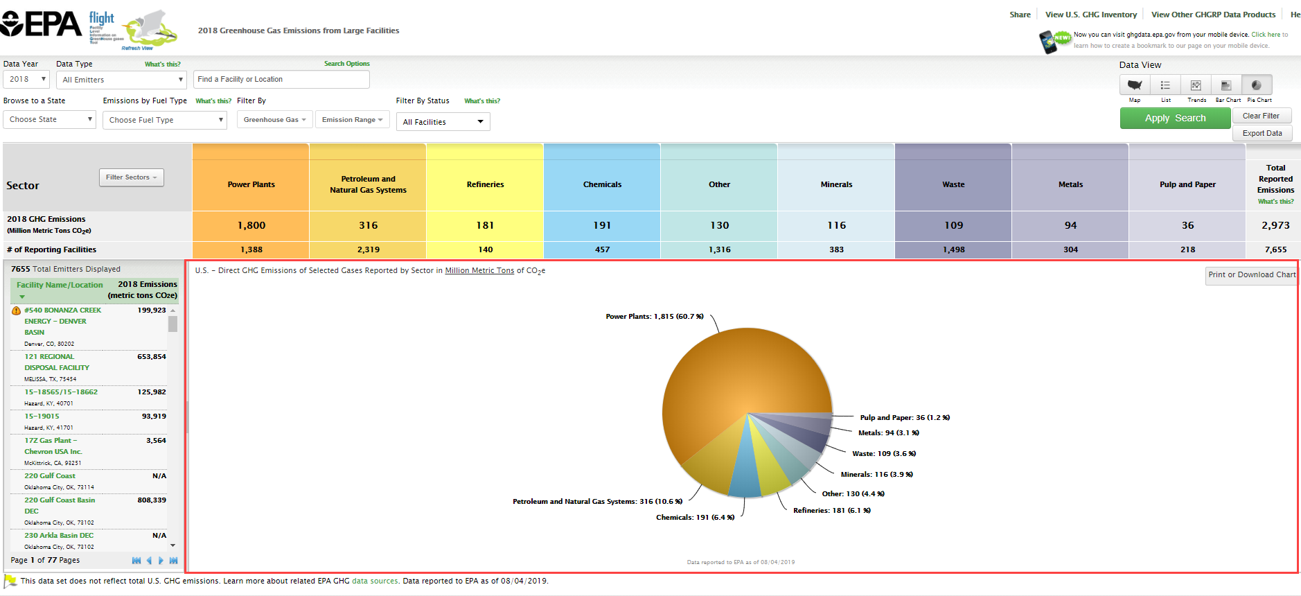
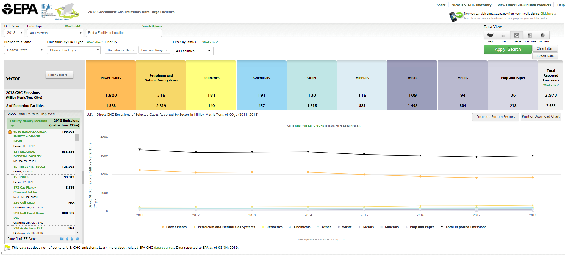
Charts
Users may view the data in three chart formats: bar chart, pie chart, or line chart. Use the toggle buttons above the visualization window to change chart type.
Bar
|
|---|
Click image to expand below |

Pie
|
|---|
Click image to expand below |

Line
|
|---|
Click image to expand below |

List
Data lists may be organized by geography (sectors within states/counties), by facility in the current year, or by changes in facility emissions across multiple years. Use the toggle buttons above the visualization window to reorganize the data and click the column headers to sort.
Facility List Geography
|
|---|
Click image to expand below |
Facility List Current Year
|
|---|
Click image to expand below |
Facility List Changes
|
|---|
Click image to expand below |
Charts
Users may view the data in three chart formats: bar chart, pie chart, or line chart. Use the toggle buttons above the visualization window to change chart type.
Bar
|
|---|
Click image to expand below |
Pie
|
|---|
Click image to expand below |
Line
|
|---|
Click image to expand below |