...
When you first log into Facility Level Information on GreenHouse gases Tool (FLIGHT), you will be presented with Important Information about this data Data Set and three search options:
...
| Section |
|---|
| Column |
|---|
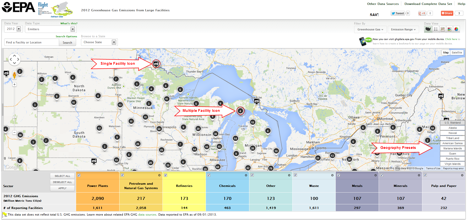
| Map
Mouse-over a facility icon on the map to display summary information for that facility and click the icon to show detailed information on that facility. Round black icons on the map represent multiple facilities in close proximity to each other. The number in the center of each black icon represents the count of facilities in that area. Click the buttons in the lower right of the map to quickly find areas outside the continental US, such as Alaska, Hawaii or Puerto Rico. Click image to expand below
 List
Data lists may be organized by geography (sectors within states/counties), by facility in the current year, or by changes in facility emissions across multiple years. Use the toggle buttons above the visualization window to reorganize the data and click the column headers to sort. | Center |
|---|
| Facility List Geography |
|
|---|
Click image to expand below
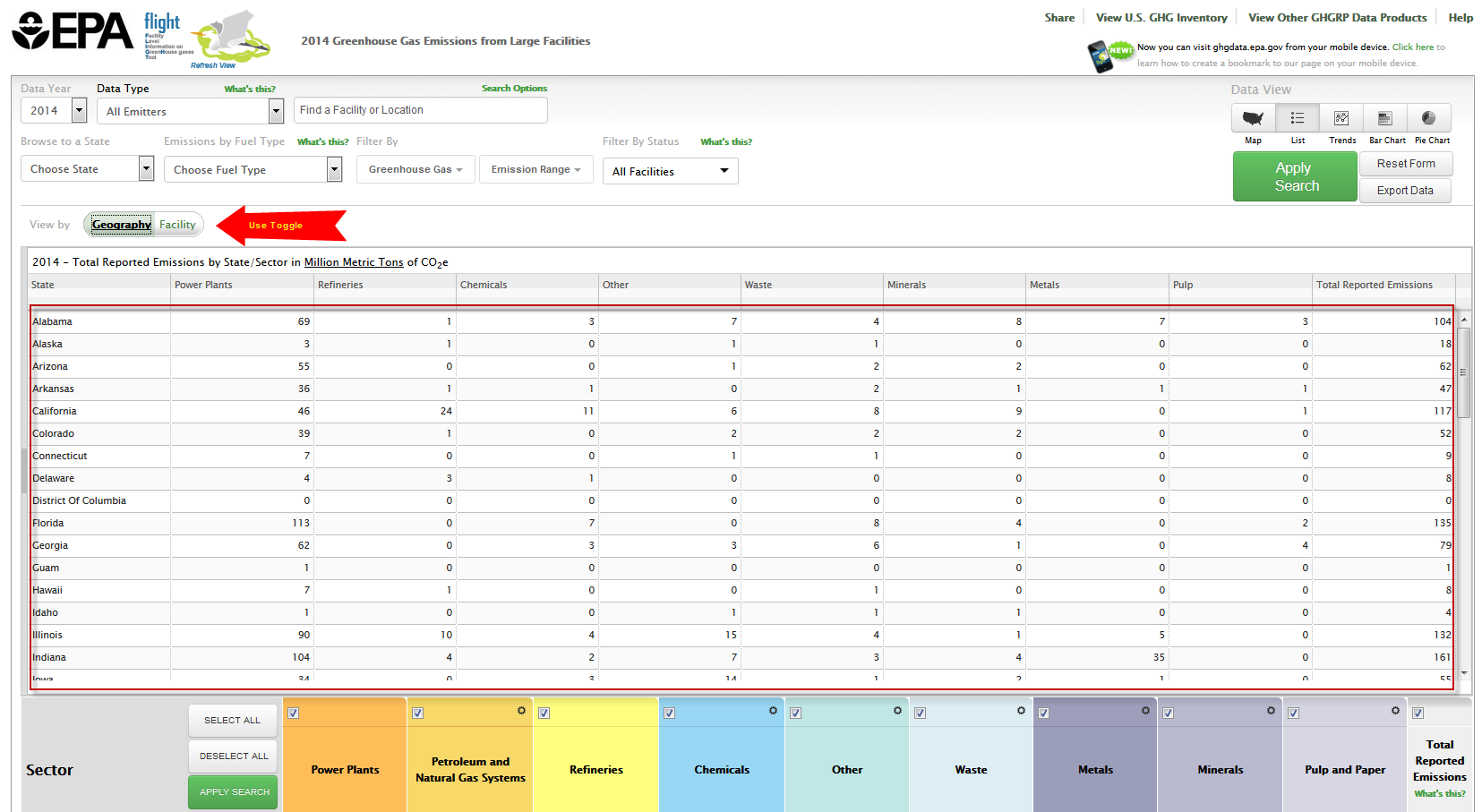 Image Modified Image Modified |
| Center |
|---|
| Facility List Current Year |
|
|---|
Click image to expand below
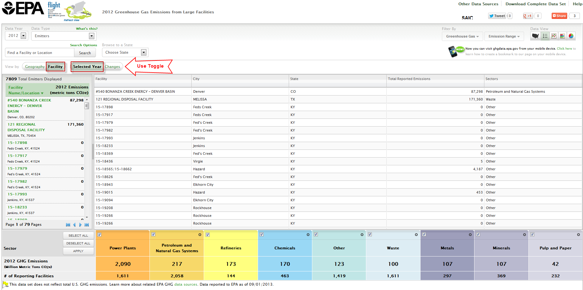 Image Modified Image Modified |
| Center |
|---|
| Facility List Changes |
|
|---|
Click image to expand below
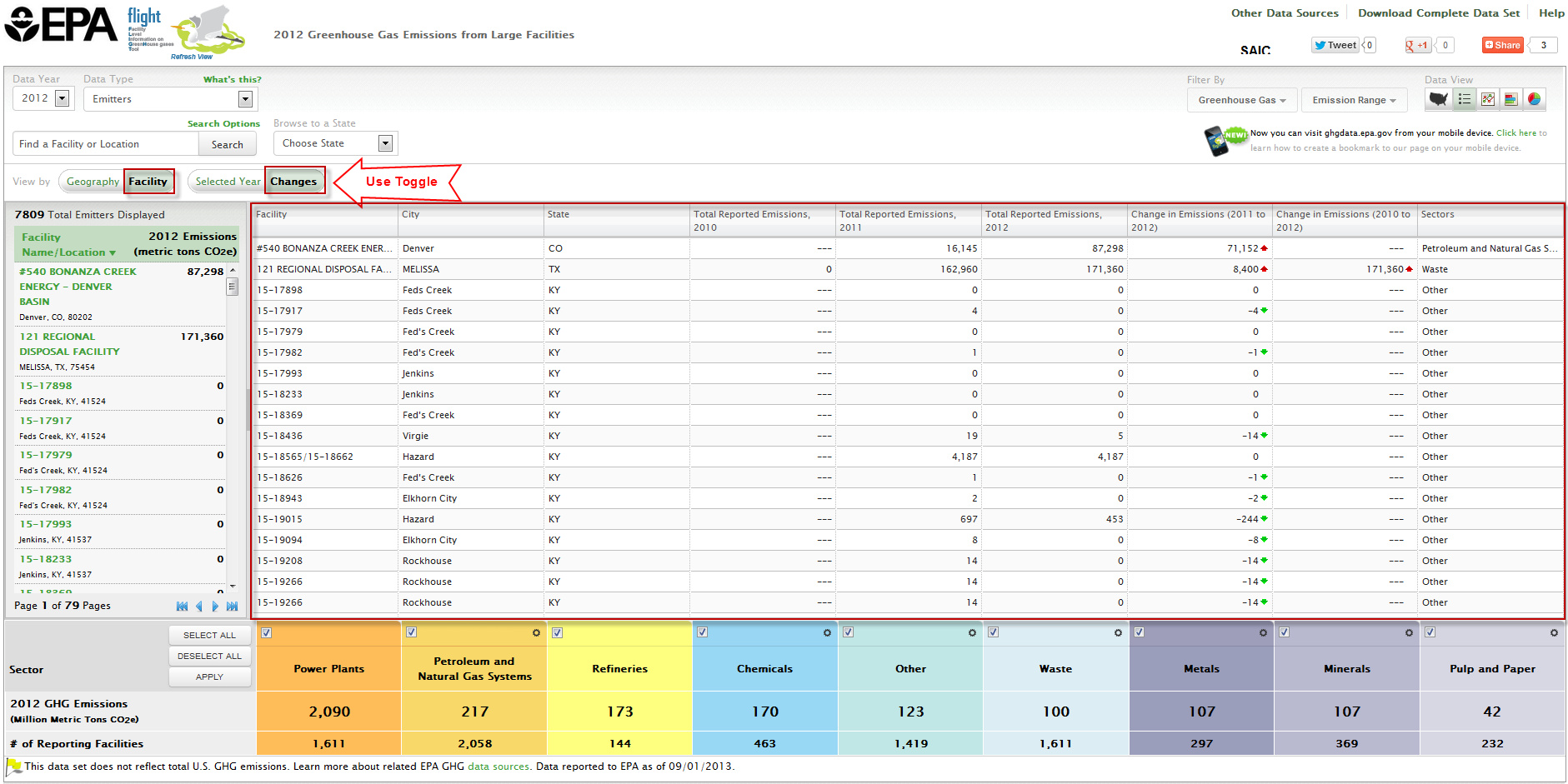 Image Modified Image Modified |
Charts
Users may view the data in three chart formats: bar chart, pie chart, or line chart. Use the toggle buttons above the visualization window to change chart type. |
|---|
Click image to expand below
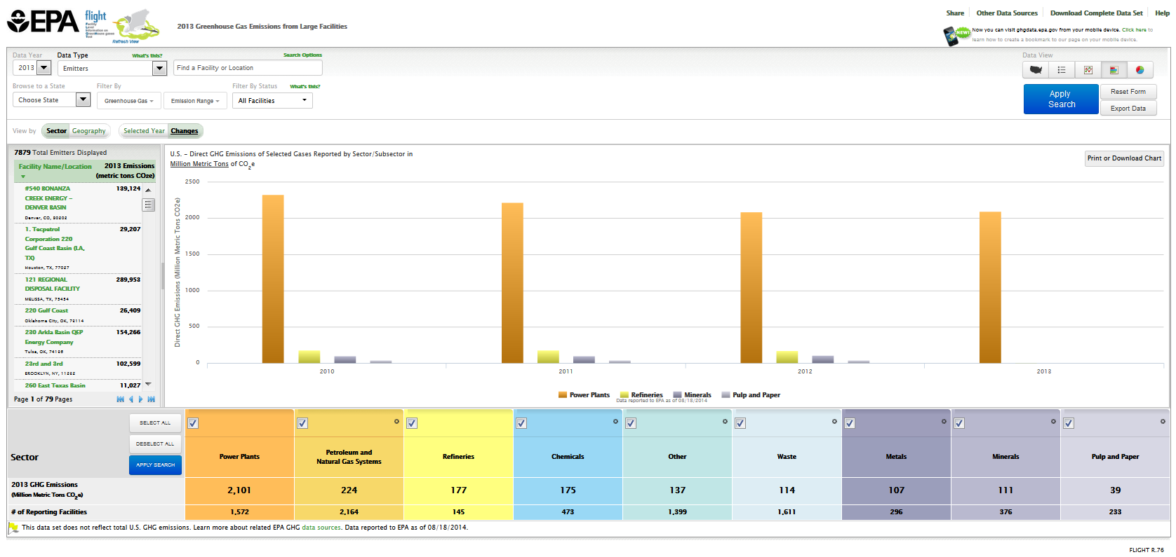 Image Modified Image Modified |
|
|---|
Click image to expand below
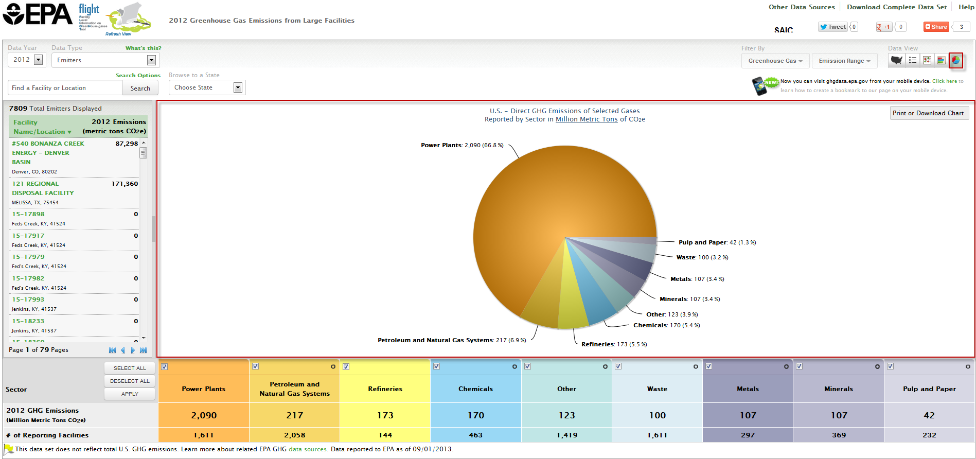 Image Modified Image Modified |
|
|---|
Click image to expand below
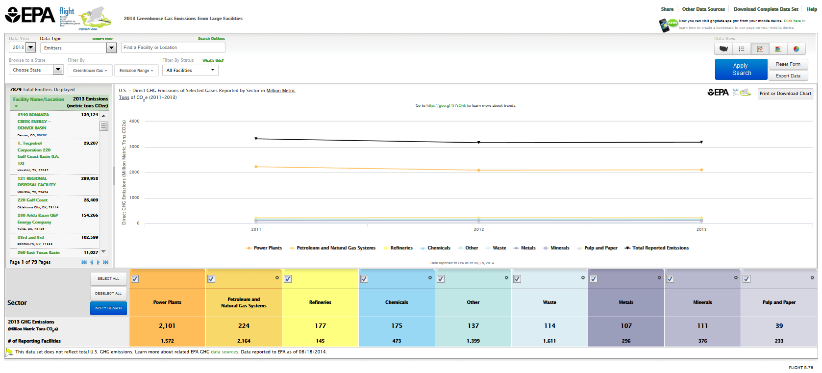 Image Modified Image Modified |
|
|
#Back to Top